
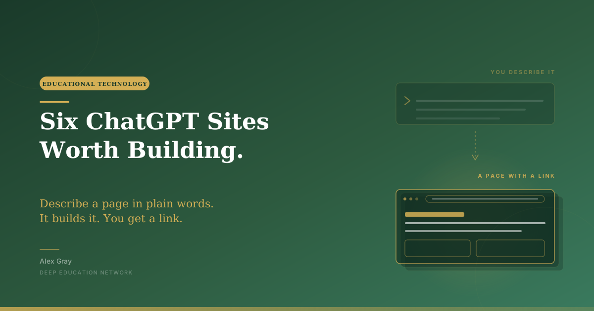
You describe a page and ChatGPT builds it. No template, no theme, no hosting. Here are six school pages worth making this week: three I have built with screenshots and starter prompts, three on the list for Saturday, and the one rule that keeps them safe.
This week we are on ChatGPT Sites, and I want to start with the part nobody tells you.
You describe a page. It builds it. That is the whole interaction.
No template to fight. No theme to choose. No plugin, no hosting question, no forty minutes lost in a menu you did not want to open. You type what the page is for and who it is for, and you get a working page with a link you can send someone.
The first time it works you will do what I did, which is immediately think of four more.
I have built three of these properly now, and they are below with screenshots. The other three are on the list for Saturday, when I film the whole thing.
One thing to be straight about before you scroll. Each build below has a starter prompt. It will get you a decent page in about a minute, and that is the point of putting it here. It is not the prompt that produced the pages in the screenshots. Those took a good deal more detail and several rounds of going back and asking for changes, which is the normal way of working with this and is most of what Saturday's video actually shows. Do not judge your first attempt against my fifth.
Start with the one that only helps you. Nobody needs to approve it, nothing can go wrong, and by the time you have finished you will know exactly how the tool behaves.
One. A planner, just for you

This was my first build and it is still the one I use. A day planner with a period-by-period run sheet, a week view, a term overview, today's tasks and a notes panel. Nothing in it but my own planning.
Starter prompt
Build a private daily planning page for a secondary-school teacher. Include today's three priorities, links to lesson materials, a personal preparation checklist, a place to note questions for colleagues and a weekly reflection prompt. Make it calm, simple and usable on a phone. Do not include student names, behaviour information, assessment data, emails or calendar content.
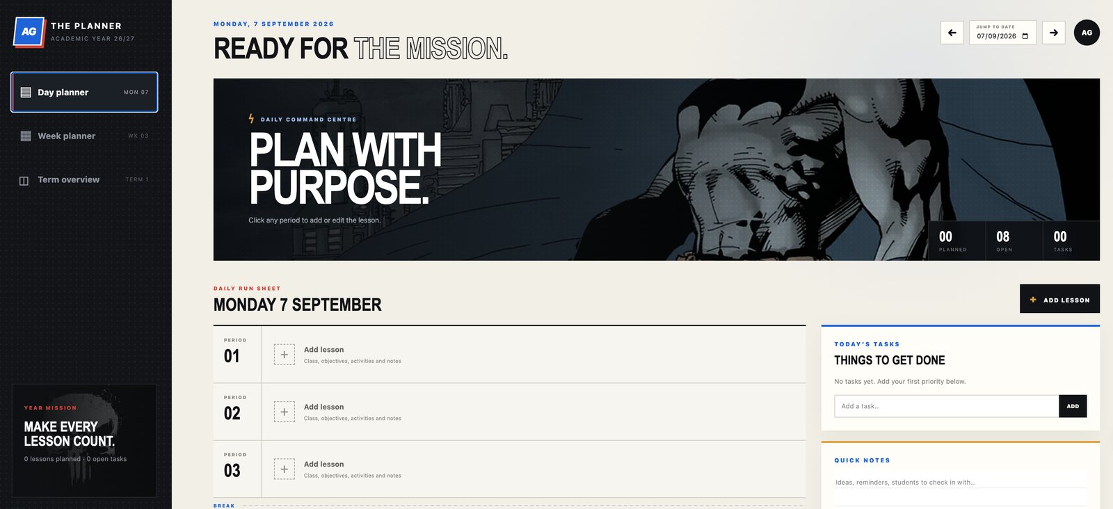
Two things I did not expect.
The first is that you can ask for a look and get one. I asked for a comic-book feel, dark and graphic, and it gave me the halftone dots, the skyline and a "year mission" panel that says make every lesson count. It is a small thing and it is not a small thing, because I actually open it.
The second is where the tool stops. It made the interface in about a minute. It cannot tell me which three things matter today. That is the part of the job that is judgement, and it stays with me, which is exactly the right division of labour.
Build it manually first. No inbox connection, no calendar connection, no automation. If you end up not using it, you have lost ten minutes and learned how the thing works. Good trade.
Two. A class home page

Now the obvious one, and obvious does not mean unimportant.
Starter prompt
Build a simple website for a Year 10 English class. Include this week's homework, upcoming assessment dates, the current unit and its essential question, class routines and a page of teacher-approved study resources. Put one notice bar at the top for the thing everybody needs to know this week. Make it easy to scan on a phone. Use clear language for fourteen- and fifteen-year-olds. Do not collect personal information.
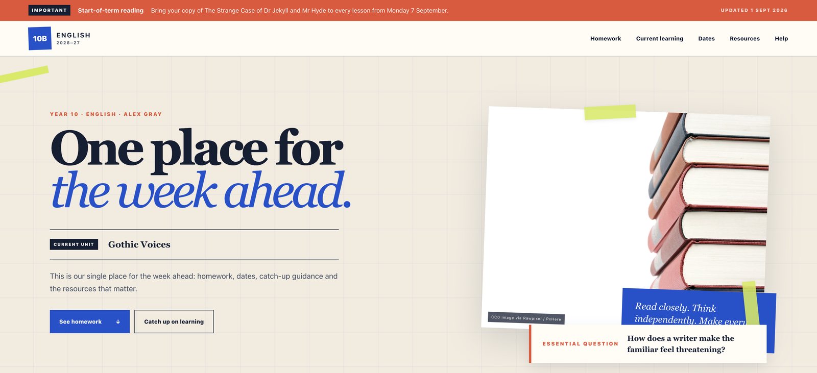
Mine ended up with a notice strip across the top for the one thing everybody needs to know that week, which at the moment is to bring your copy of Jekyll and Hyde to every lesson from the seventh. Under it, the current unit and the essential question we are working on, then homework, dates and resources.
The design is beside the point. What you have now is one URL. Students get a place to start, parents get less reason to hunt through three systems at half past eight in the evening, and you get to stop answering the same message four times a week.
One piece of advice from getting this wrong first time: do not put everything on it. That is how a helpful page becomes another thing to maintain. Pick four items, the ones that change and the ones people ask about repeatedly, and update them on a Friday.
Three. A staff induction hub
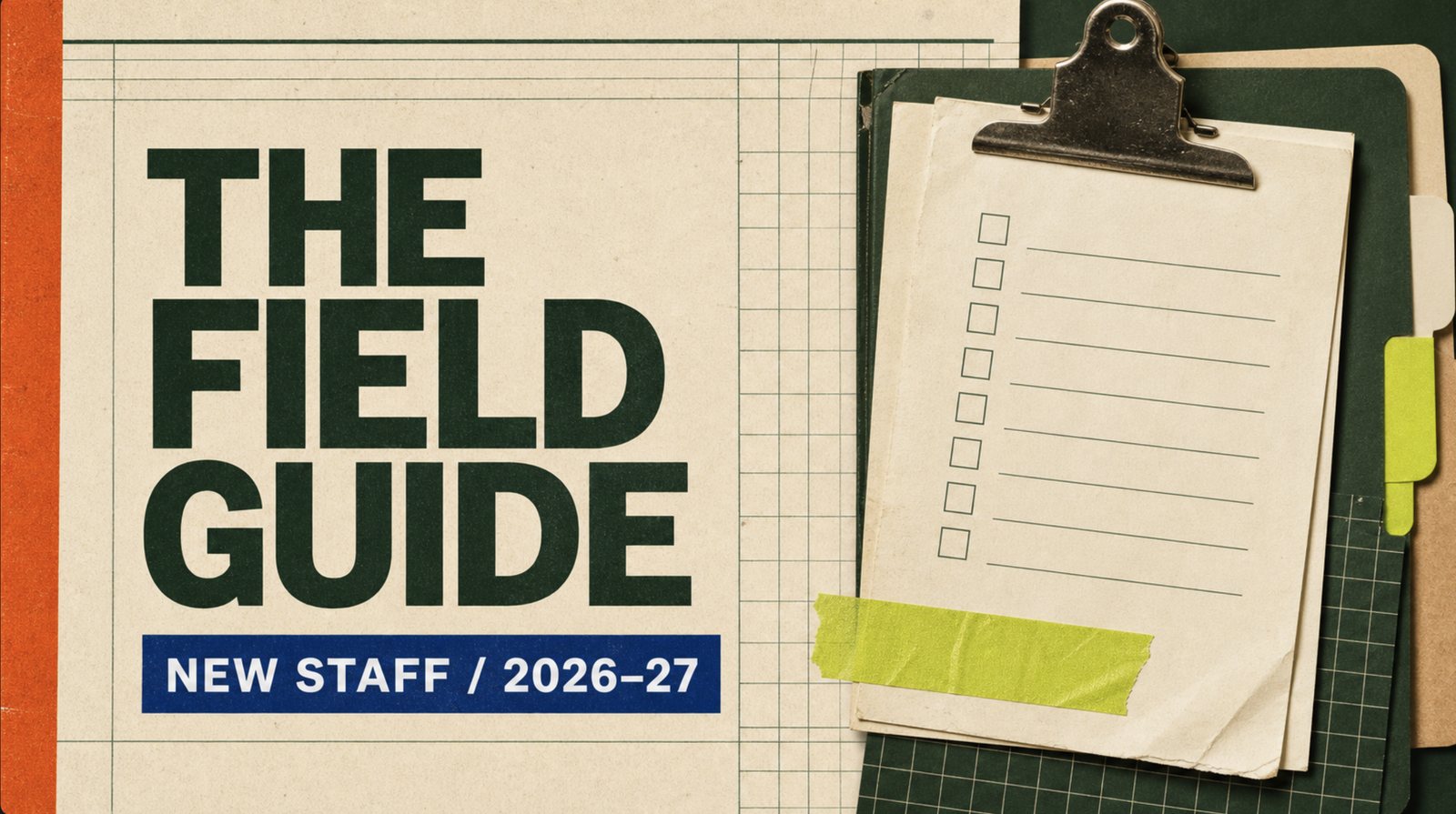
A good induction is a sequence of things somebody can do in their first week. Most of us hand over a folder.
This one depends on whether your workspace supports limited sharing, so settle that before you build. If it does not, do not call it a staff portal.
Starter prompt
Build an induction hub for new secondary-school teachers. Organise it as day one, week one and first half term. Include a welcome checklist, links to approved policies, key contacts by role using published school contact details only, a map of the school site and frequently asked questions. Keep it calm and practical. This is for authorised staff only. Do not include staff records, personal contact details, student information, passwords or confidential documents.
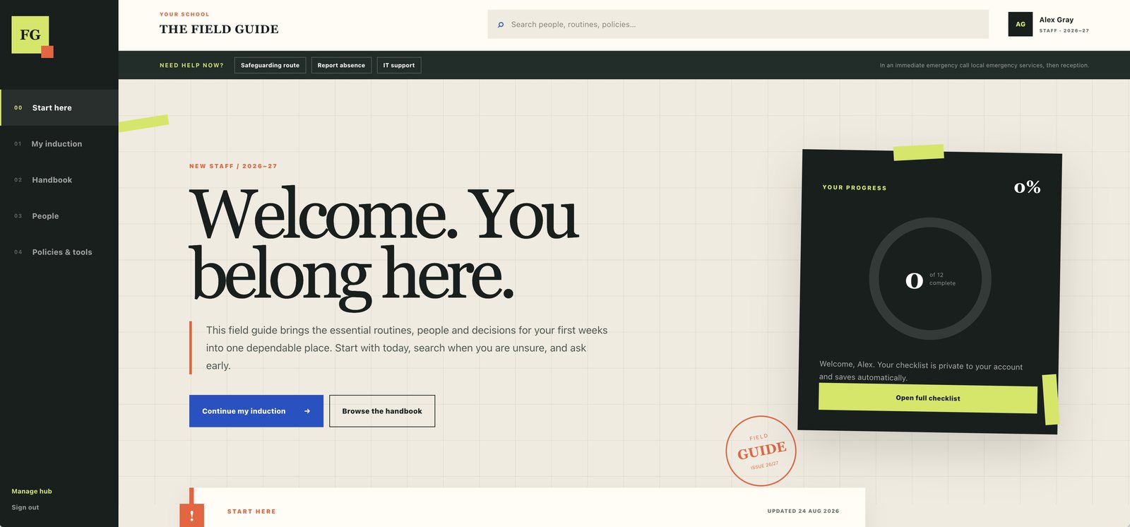
The bit I would steal from this one is the row along the top: safeguarding route, report absence, IT support. Three things a new member of staff needs in a hurry and currently has to ask somebody about while feeling like an idiot. Getting them above everything else took one line when I asked for it, which is the whole trick with this tool.
The wording is the work here. "Read the behaviour policy" sits unread until October. "Read these three pages before your first duty, then ask your line manager this question" gets done. You are turning documents somebody has to find into a route somebody can follow.
The one thing to keep an eye on
Before the outward-facing ones, a line that saves you a conversation later.
Publish information on a site. Collect data in your school's approved systems. Name nobody you would not name on the gate.
That is it. Sites is a noticeboard, and a good one. It is not the place for consent forms, sign-ups, wellbeing check-ins or staff mobile numbers, however tempting that is when the proper system is being slow. If the information would be fine pinned up in reception, it is fine here.
Worth knowing too: ChatGPT Sites is in public beta, and OpenAI says availability and sharing controls vary by plan, region and workspace, with its guidance advising you review a site before publishing (creating and managing Sites; your responsibilities). Check what your account can do before you promise anyone anything.
Three more on my list for Saturday
Four. A revision companion
This is the one I find most interesting, because it is where the design choice actually matters.
Build a page full of answers and you have not built revision support. You have made escape from thinking look organised. The version that helps gives students a sequence: what to retrieve, what to explain, what to practise, and where to go when they are stuck.
Starter prompt
Build a revision companion for a Year 11 GCSE biology topic on homeostasis. Include a short list of key ideas, retrieval questions with answers hidden behind a button, links to teacher-approved resources, three exam-style practice tasks and a section called "When you are stuck". Do not include a chatbot, answer generator or personal-data collection.
Notice the constraint at the end. No answer generator. The job of the page is to structure the work, not to produce it.
One page per topic, not one giant revision universe. Start with the unit students found hardest last year, then ask a student who is not confident whether they can tell what to do first. If they cannot, you have built decoration, and it takes two minutes to fix.
Five. An event page
Open evening. The school production. Sports day. A trip. All the same problem, which is where to be, when, and what to bring.
Starter prompt
Build a one-page mobile-first site for a secondary-school open evening. Include the date, arrival times, programme, parking and accessibility information, a simple map, a checklist for families and an FAQ. Make the next action obvious. Do not collect RSVPs or any visitor information.
The test is almost embarrassingly simple. Can a tired parent, standing in a car park, find the arrival time, the entrance and the next thing to do in ten seconds? Build the page around the questions people actually ask on the day rather than the information the organiser happens to have to hand.
Six. A parent information hub
Starter prompt
Build a mobile-first information page for families joining a secondary school. Include clear sections on uniform, attendance, devices, homework, transport and how to contact the school. Add a "start here" section for new families. Use plain English, short paragraphs and links that a school administrator can update. Refer to staff by role and use the school's published contact details only. Do not include a contact form or ask visitors to submit personal information.
It is deliberately boring, and that is praise. The best school information usually is. It has to be accurate, readable and there when somebody looks.
Two things make the difference. Explain simply and link to the real policy rather than writing a second version that quietly drifts from it. And give it one named owner who checks it each half term, because a page nobody owns becomes another source of confusion by Christmas.
What makes a good one
Once you have built two or three you will see the pattern, and then you can build the seventh without me.
Every starter prompt above says the same four things. Who the page is for. What goes on it. How it should read, usually plain and phone-first. And what it must not do.
That last one is the bit people leave out, and it is why these pages come back sensible. The tool will happily add a contact form or a chatbot if you do not say otherwise.
The distance between one of those starters and the pages in the screenshots is not a secret prompt. It is specificity and rounds. Name the sections you want. Say what goes at the top and what can wait. Describe how it should feel to look at. Then build it, look at it, and tell it the three things that are wrong. My planner took several passes and is better for every one of them, and watching that happen is more useful than reading a finished prompt, which is why the full versions are in Saturday's video rather than pasted here.
Then before you send anyone the link: check it on a phone, expect to send two or three corrections before it reads right, and give it to one colleague or student before you give it to two hundred. If it turns out to be no more useful than what you already had, delete it. Being able to make a page is not a reason to keep one.
Have a go at the planner tonight. A first version takes about a minute, and you will know within five whether the rest of this list is worth your time.
Companion: on Saturday I build these on screen with the full prompts, the corrections and the bits that go wrong.
Sources: OpenAI, "Creating and managing ChatGPT Sites" and "Understanding responsibilities for your ChatGPT Sites", help centre, checked July 2026.
If you want to work out where AI can take friction off your school without taking thinking away from students, the free DEEP AI Literacy Audit takes fifteen minutes: audit.deepeducationnetwork.com

Stay in the Loop
Get practical insights about AI in education, new articles, and training updates delivered to your inbox.
No spam. Unsubscribe anytime.
Work With Alex
Looking for hands-on support with AI integration, curriculum design, or teacher professional development? Alex works with schools and organisations worldwide to build practical, evidence-informed approaches to education technology.