
Claude Design turns a sentence into a polished, on-brand school resource. A teacher's walkthrough for Monday, with screenshots, the design-system move for department leaders, and the limits worth knowing first.
Everything below comes from using Claude Design myself this week, with screenshots from my own account. Where a claim comes from somebody else's walkthrough rather than my own screen, I say so.
Making school materials has always been two jobs wearing one name.
The first job is deciding what the resource needs to do. Which misconception it targets. How the scaffolding steps down for the students who need it. What a good finished answer actually looks like. That job is teaching, and it is hard in the way teaching is hard.
The second job is production. Fonts, margins, the forty minutes you spend persuading a text box to sit where you put it. That second job only ever looked creative; mostly it was admin.
In April, Anthropic Labs released a tool called Claude Design, and it collapses the second job. You describe the resource you want, in ordinary language, and it hands you a polished first version to work on. If you have a paid Claude plan you already have it. Look down the left-hand side of Claude and you will find it under Design, with a small Labs tag next to it.
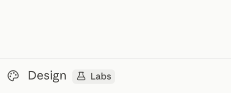
It sits quietly in the sidebar. The Labs tag is your reminder that it is still moving.
So production has collapsed. Deciding has not. And what makes this worth half an hour of your evening, rather than being another export button, is that the tool now asks you to do the deciding out loud, and puts a button next to the question so that you can skip it.
It asks the teaching questions before it builds
The first thing it wants is not your topic. It is the kind of thing you are making. Every project starts from a template, and there are plenty of them: blank, slides, documents, diagrams, fliers, wireframes, animations, research reports, even a 3D object if you ever need one.
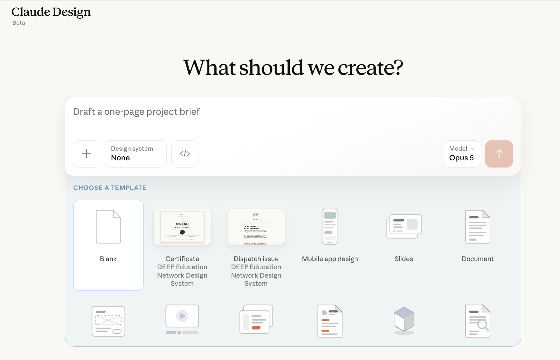
The home screen. Note the two DEEP templates in the second and third slots, generated from our own design system, and the model picker sitting on the right.
For schools, documents, fliers and diagrams are where most of your work will live. You will also see a design system selector and a model picker on the prompt box itself, and both of those matter more than they look. We will come back to them.
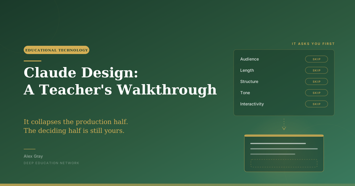
Then it stops and asks you some questions. Who is this for. How long should it be. How should it be structured. What tone. How interactive. Each one comes with an option to let the tool decide for you.
That option is the part of the interface I would want to talk about in a staff meeting, because those five questions are not admin. Audience, length, structure, tone and interactivity are exactly what make a resource land or fall flat in a specific room, and they are now a dialogue box with a skip button on it. This is my reading rather than a finding, but I think the discipline this tool quietly asks for is answering those questions properly on the days when nobody is checking whether you did.
Four ways to change it, and they are not equally cheap
Once you have a first version, you have four routes back into it, and it is worth knowing all of them before you settle into a habit.
Tweaks is the one to learn first. You describe the control you want and it builds it for you, as a toggle or a slider that applies right across the design at once.
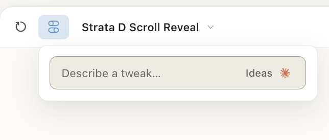
You do not hunt for a setting. You describe the tweak you want and it makes you one, with an Ideas button if you would rather be prompted.
Ask for a toggle for the school crest and another for page numbers, and you can flip both across a whole resource pack in one click. The school version of that is where it gets interesting. Add a toggle for a support box, on for the class that needs it and off for the class that does not, and you have two versions of one worksheet without maintaining two files. I have not seen anyone demonstrate that particular use, but it is the same mechanism, and it is the first thing I would try.
Edit is direct manipulation. Click the text, change it yourself, no instruction needed. Sometimes that really is the quickest way.
Comment pins a plain-English instruction to one part of the page, and it doubles as your drawing tool. Click for a comment, or drag to circle a region and describe what is wrong with it.
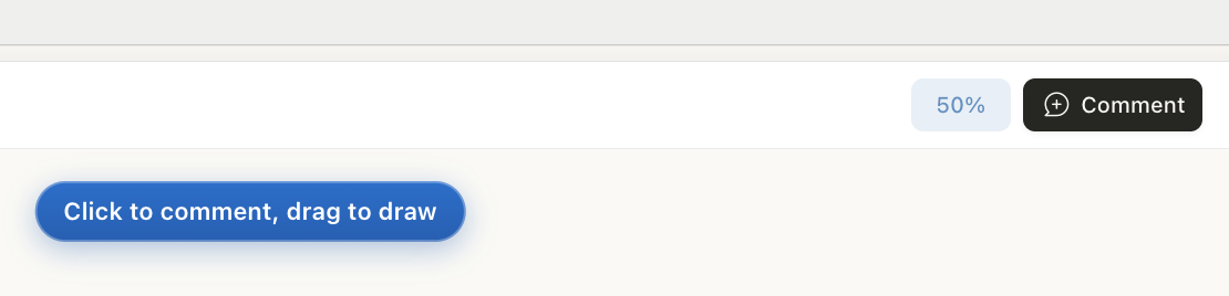
Dragging to draw is the route I reach for when something is hard to name. Spacing, gaps, two things overlapping.
Chat handles everything structural, anything that changes what the resource is rather than how it looks, and it is the most expensive of the four.
That order is deliberate. Coarse and cheap first, fine and cheap next, model-driven and expensive last. If your school is keeping an eye on its allowance, that little hierarchy is worth teaching your team before any of the features are.
The design system is the school-level move
This is the piece I would spend your first hour on. You build a design system from your own material, and every resource you make afterwards comes out looking like your school without you asking.
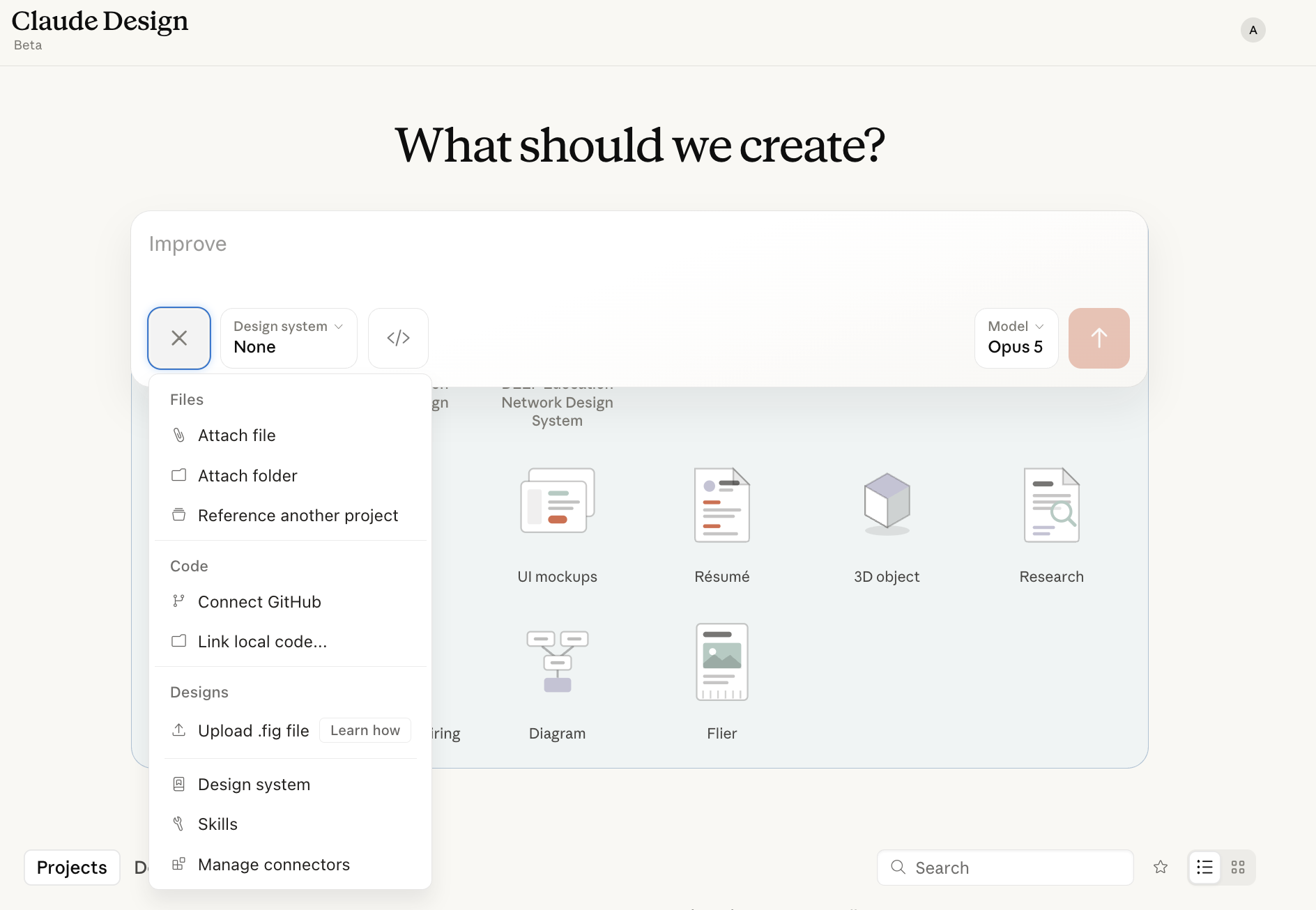
Where the raw material goes in. Files and folders for most of us, a Figma file if your marketing team has one, and a Design system entry you can open at any time.
Hand it a department workbook, last year's slides and the school letterhead, and it gives you back your colours, your fonts and your layout habits as a system that later resources apply automatically. Two things worth knowing. It is not an onboarding step you can miss, so if you clicked past something on day one you have lost nothing. And you can hold more than one, which is how Key Stage Three materials and sixth form materials stop looking like they came from different schools.
Do expect a wait. Building a system from a decent-sized upload took me the best part of quarter of an hour, and what comes back is a proper document of colours, type, components and sample layouts that you approve before anything uses it.
Approve it properly, though, because this is the moment nobody in the published walkthroughs bothers with. Check the contrast. Check it is still legible after the photocopier has had its way with it. Check the palette survives being printed in greyscale, because plenty of your resources will be. And check the reading age of whatever body text it has chosen as your default.
A worksheet before Monday morning
Try this with something real from your first week back.
Start by describing the worksheet the way you would describe it to a colleague:
Make a one-page worksheet on balancing chemical equations for Year 9. Three sections: a worked example with the steps numbered, six practice questions that get progressively harder, and a support box at the bottom with sentence starters for students who get stuck. Space to write answers on the page. Use my school's design system.
That is a starter prompt, and only a starter. The version I would actually print names the misconception I am targeting and says what a wrong answer to question four should look like, and it takes two or three rounds of refinement to get there. That is not a failure of the tool. It is just what the job is.
The refinement round is where it earns its keep. Mark up the first version the way you would mark up a trainee's draft. Comment on question four. Tell it in chat that the support box reads like it was written for teachers and to try again in student language. Add a Tweak for the support box so you can turn it off for your top set. Each pass takes a minute or two.
Then look hard at what it has given you, because this part stays yours. Check the chemistry first, since a beautifully set worksheet with an unbalanced equation on it is worse than a plain one that is right. Then the teaching. Is question six actually harder than question five, or just longer? Do the sentence starters scaffold the thinking, or hand over the answer? Does this fit the class you have in front of you, the one where two students read three years below their age and one finished the textbook in June?
When you are happy, getting it out is easy.
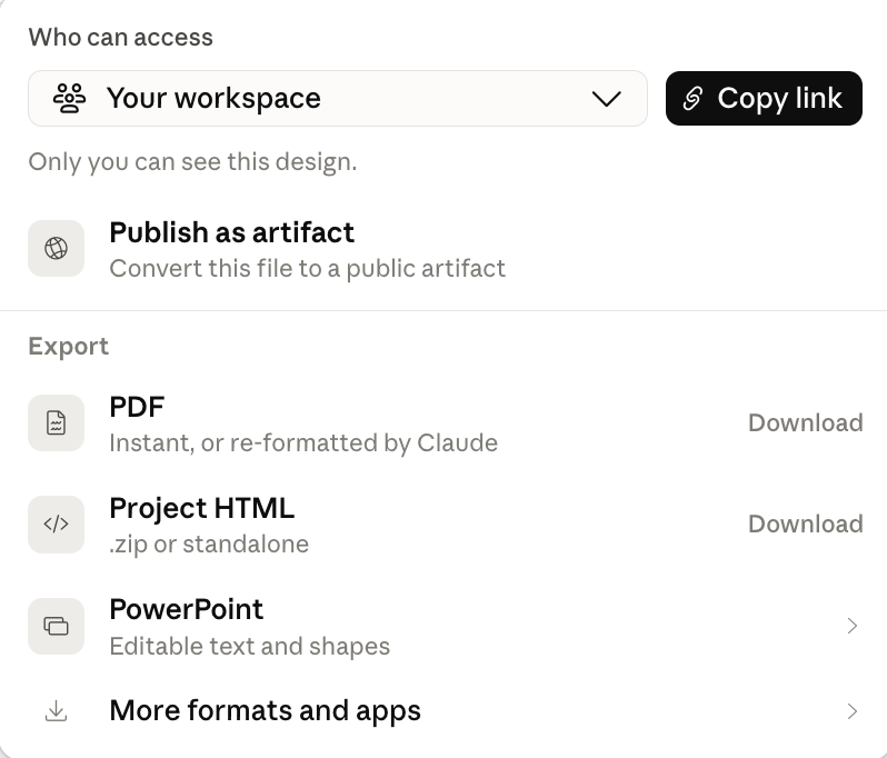
PDF for the photocopier, PowerPoint if you want editable text and shapes on the whiteboard, and standalone HTML if you want one file that opens anywhere.
That standalone HTML option is worth a moment. One file, opens in any browser, nothing to install, works on whichever machine happens to be bolted to the wall in the room you have been moved to. If you ask, Claude will build a presenter view with your speaker notes into it. There is also a Publish as artifact button, which turns the design into a link you can simply send to somebody.
Export, print, done. The production half took ten minutes instead of an evening. The deciding half took as long as it always did.
If you lead a department
This one depends on your plan. Sharing a design system needs Team or Enterprise. On Pro you can build one very happily, you just cannot hand it to anybody.
If you have the plan, build the department's design system once from your best existing materials. New staff then produce materials that look like yours from their first week, and consistency stops being something you ask for in a briefing and becomes the easiest available option. One practical note before you promise it to everyone: publishing a system so that new projects pick it up automatically looks like an organisation-level action rather than a departmental one, so you will probably want whoever administers your account in the room.
VentureBeat reported in June that outputs are now checked against the design system and auto-corrected rather than loosely following it, which is the difference between a house style people ignore and one that applies itself. It governs how things look, though, not whether they are any good.
The move I would make next is less obvious. Jeff Su's walkthrough shows the tool writing a standing instructions file, a claude.md, into a project and reading it before every future design. Ask for that as well as the edit, and over time the file becomes your department's accumulated judgement: support boxes at the bottom, never red for corrections, sentence starters in student language. Schools are usually poor at holding that sort of knowledge anywhere except in the heads of the people who have been there longest, and this is a rare chance to give it somewhere to live.
Two things to settle before any of this reaches a briefing. The first is data protection. This workflow asks your staff to upload department materials, letterheads and crests to a third party, and somebody in your school needs to have decided what may go up, what may not, and what changes the moment a resource contains a student's work or a student's name. The answer depends on your plan and your jurisdiction, and it is not a question a head of department should be left to answer alone.
The second is the setting itself. On Enterprise plans the feature is off by default and an administrator has to turn it on in organisation settings, under capabilities. If your school runs Enterprise, that is a conversation worth having before September, covering who gets it, what it may be used for and what still needs a human sign-off. Much better to decide it in a meeting than to let it get decided one teacher at a time.
The one nobody in education is using yet
Claude Design will animate an explanation for you. Give it the animation template and a description, or feed it a timestamped transcript, and it produces motion graphics synced to the words, which you then refine by timestamp.
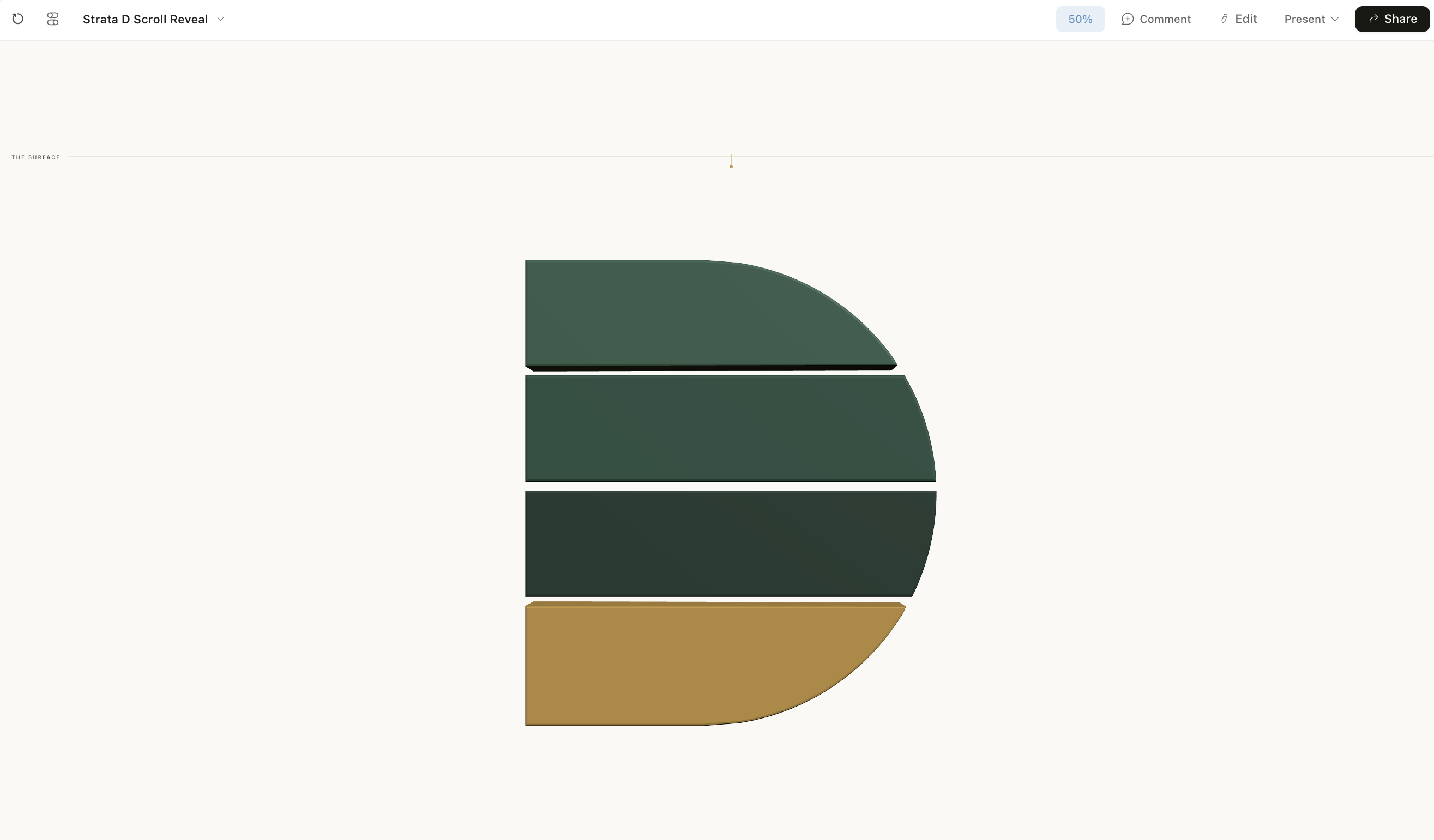
This one is ours, mid-build. The same workflow makes an explainer of a process students struggle to picture.
I went through six published walkthroughs of this tool and every animation example is a marketer making video B-roll. Not one is the water cycle, or long division, or how a bill becomes law. And it does export properly: MP4 sits under More formats and apps, alongside PNG for a single element and direct sends to Canva and Gamma.
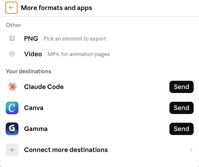
MP4 export for animation pages, which is the bit most of the walkthroughs were still working around.
One caution before you build a lesson on it. An animation that shows a process wrongly does more damage than a sentence that describes it wrongly, because students remember the picture.
The honest limits
This is still a beta, so it will change under you, and a feature you build a routine around may move. It has already changed twice this year.
Take the cost seriously. It draws on your Claude allowance, and it draws hard. At launch, when Design had its own separate weekly meter, people were reporting that a single project ate most of a week's quota. Anthropic bundled the usage into the main allowance in June and reduced what it consumes per turn, but if your school is on Pro, my honest estimate is that a design system build plus a couple of substantial resources will be a noticeable part of your week. Have a look at your usage in Claude's settings before you promise a department a workflow.
The model picker helps here, and it is the single most useful habit I have picked up. Opus 5 to build the first version, something lighter to iterate.
Save a copy before any big change, too. Recovering an earlier version is not as simple as pressing undo.
One limit will catch schools in particular. The tool does not place your uploaded logo; it redraws it. The walkthroughs report that simple wordmarks come through fine while detailed marks with fine linework do not, and most school crests are the second kind. A parent letter that goes out with a subtly wrong badge is a small, avoidable and entirely public embarrassment, so run your own crest through it before anything carrying the badge leaves the building. It takes about ten minutes to check.
The last limit is the one no update will remove. Claude Design has no idea who is in Room 12 on Tuesday afternoon. It does not know that your Year 9s met ratios last term and hated them, or that the quiet girl at the back needs the challenge question or she switches off. Everything that makes a resource right for a specific room still comes from you.
None of which should read as a warning. The part of resource-making this absorbs is the part nobody went into teaching for, and what it leaves you is the part you were trained for, plus a dialogue box that asks you, every single time, whether you would like to do it yourself. The tool borrowed its taste from your files, but there is no pedagogy in a font.
If you would like a proper evening on this before term starts, that is exactly what our Back to School AI workshops are for. Five ninety-minute evening sessions, 24 to 28 August, ten dollars a session, live and practical. Details at deepeducationnetwork.com/back-to-school.
Sources
- Screenshots and first-hand product detail from Claude Design, 6 August 2026: templates, the design system and model selectors, Tweaks, comment-and-draw, the export panel, MP4 video export and the destinations list are all from my own account.
- Anthropic, "Claude Design" launch announcement, Anthropic Labs, 17 April 2026: anthropic.com/news/claude-design-anthropic-labs. Launch date, plan availability and organisation-scoped sharing.
- Anthropic help centre: Get started with Claude Design, Set up your design system and Claude Design admin guide for Team and Enterprise plans. Beta status, bundled usage and the Enterprise off-by-default setting.
- VentureBeat, "Anthropic ships major Claude Design overhaul with design system imports, code round-trips, and a fix for its token-burning problem", 18 June 2026: venturebeat.com.
- Six published walkthroughs, April to August 2026, which are the source for the launch-era usage reports, the standing instructions file and the logo redrawing behaviour: Paul J Lipsky, "Master 80% of Claude Design in 15 Minutes" (19 April) and "How To Create Stunning Motion Graphics" (30 June); Nate Herk, "Claude Design 2 Hour Course, Beginner to Pro" (30 April); Futurepedia, "A Complete Guide to the New Claude Design" (19 July) and "Claude Design Just Unlocked AI Motion Graphics" (4 August); Jeff Su, "Claude Design is Insanely Easy (even for beginners)" (21 July).
Filed under

Stay in the Loop
Get practical insights about AI in education, new articles, and training updates delivered to your inbox.
No spam. Unsubscribe anytime.
Work With Alex
Looking for hands-on support with AI integration, curriculum design, or teacher professional development? Alex works with schools and organisations worldwide to build practical, evidence-informed approaches to education technology.